Colour Directions in Home Decor for the New Year
Colour has definitely made a come back for the past couple of seasons in the home decor market. Though the Canadian market as represented by the masses is still fairly conservative and thus, more neutral, the high end market is definitely showing more colour. The breadth of colour we’re seeing is the interesting story.
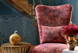
When we were in New York last spring visiting the Kips Bay Showhouse, many of the rooms there were done in very saturated colours. See our blog post here for a summary of what was hot there. Robert Allen Fabrics also released a wonderful, very saturated colour fabric collection last year which had us all drooling in our studio: namely, Pigment, Virdian, Cobalt, Fuschia and Turquoise.
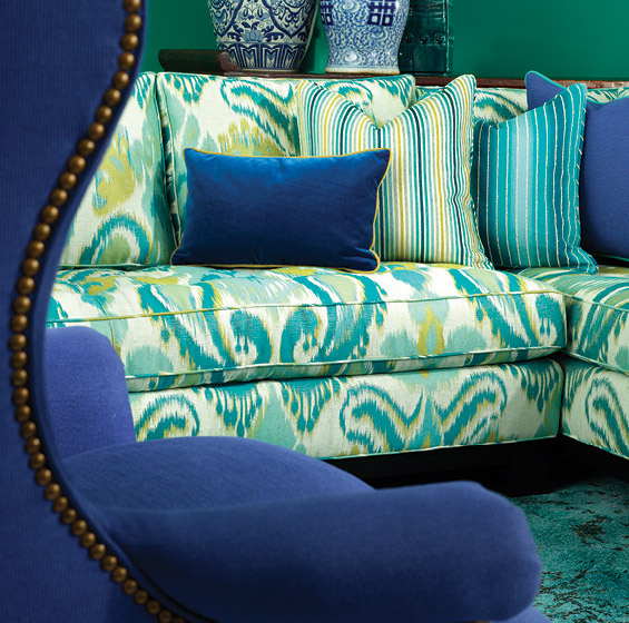
Photo courtesy of Robert Allen Fabrics
Colours were vivid, bold and exciting. However, the best we could do with this collection was entice some clients to use these for pillows or a small accent chair. In the Canadian market, the larger upholstered goods were being produced by the truck loads in greige. (a cross between beige and grey) Walls were being painted in varying tones of greige and drapery perhaps, had a little geometric pattern happening to add some life. Definitely not much viridian or fuschia happening in a big way.
When Pantone announced the colour of the year for 2014, many in the design industry were a little surprised by it. Leatrice Eiseman, executive director of Pantone, says Radiant Orchid which is a cross between fuschia and purple is “An invitation to innovation, Radiant Orchid encourages expanded creativity and originality, which is increasingly valued in today’s society.” This was in keeping with the intense colours that we had spotted at the showhouses.
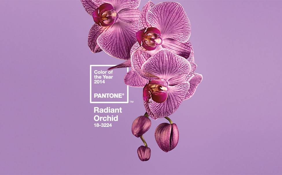
Radiant Orchid – 2014 Pantone Colour of the Year
However, Benjamin Moore delved into another direction for the home decor industry. They saw cool colours and pastels dominating the fashion and decor markets. So they named ‘Breath of Fresh Air’, a very ethereal blue, as their colour of the year. They claim it as a ‘new neutral’ that is livable and functional.
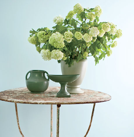
Benjamin Moore Colour of the Year – Breath of Fresh Air
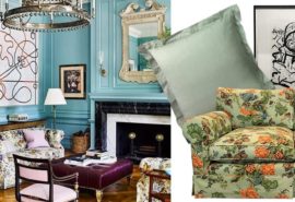
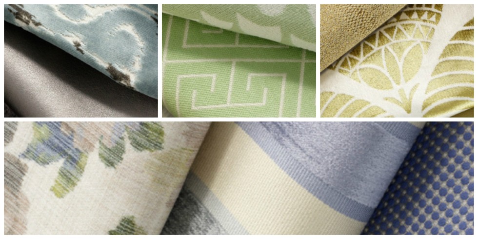
This winter/spring Robert Allen has come out with its newest fabric collection which echoes the Benjamin Moore colour story. They call it the ‘Filtered Colour’ collection. It is a beautiful collection of, dare we say it, ‘pastels’ reminiscent of the 80’s….No worries. Slightly new colourations, combinations, textures and patterns make it totally 2014 fresh. You will see greyed down purples and blues, gold leaf (on the heels of the return of gold and brass in metals), mint greens and yes, greys. Lumar’s prediction is that this collection will have a strong, long life. It is exciting but in a quieter way than last year’s collection and very livable.
Courtesy of Robert Allen
So, when you have big companies like Benjamin Moore and Robert Allen Fabrics forecasting pastels as the next new wave in colour, well, we won’t argue with them.
I think they’re onto something. We’ll leave the more vivid intense colours for smaller areas.
What do you think? Which colour direction would you go in: intense or pastel?
We’d love to hear from you, so let us know:)