The ‘Anti-Trend’ Trend for 2015
At about this time every year all the major publications and design bloggers put out their what’s hot/what’s not lists. This year we’ve noticed a growing sentiment against this ritual.
I’m calling it the Anti-Trend trend.
Everyone wants to know what’s the latest and greatest. And new trends usually put a fresh spin on old classics. So there is nothing wrong with them. Its when they are overdone for lack of an authentic aesthetic that they seem well, soul-less. It’s the ‘me-too’ option. As one of my clients put it to me recently: when you see the trend on everything from fabrics to rugs to lamp shades, well it makes you want to ‘run for the hills’. The key is to know yourself and what you love. When a trend comes your way that speaks to you then put it in the mix – otherwise, ignore it.
As Lynda Reeves puts it in her January 2015 editorial of Canadian House and Home Magazine, “But equally important to this process (of looking at new trends) is the power of refusal….Your home should offer a narrative about you and how you choose to live…The infinite range of choices is there mostly for you to reject.” Beautifully put.
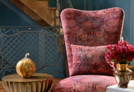
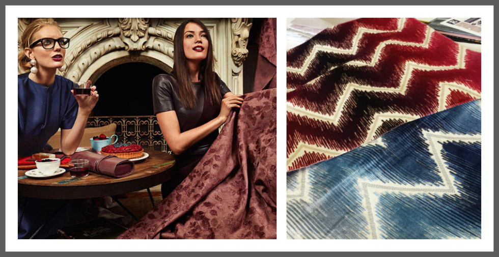
Do what speaks to you. For instance, I’ve never been a big fan of chevron, a hot item the past few years. It is now on the ‘what’s not’ list for this year – beaten to death really. However, our Schumacher rep came in the other day and introduced us to a gorgeous chevron in a silk velvet – wow! Now this would make a great accent. Not because its in or out – it was just plain gorgeous to us. I’d use that in a heartbeat.
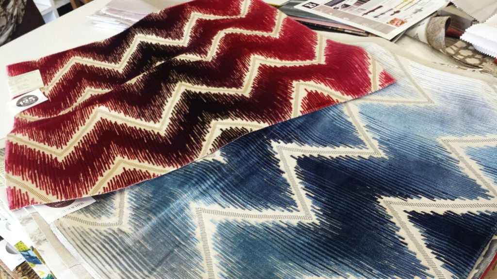
Shock Wave Silk Velvet by Schumacher Fabrics
So keeping this in mind here are some new things happening on the design front. Take what you like and forget the rest.
COLOUR
Grey is out – yes, the masses are just catching on….but it has passed its peak. Its still great as a neutral for your wall or tile. But there is more going on elsewhere. We have colour going in two directions. So lots to choose from.
1. Pastels are it. At the High Point Furniture Market this fall we noticed many showrooms were showing soft mauves and soft pinks – really quite feminine. Loved it! The european fashion and design scene have also been showing lots of soft pinks.
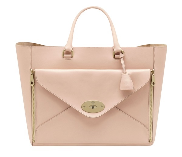
Mulberry
Reflective of this lighter end of the spectrum Benjamin Moore chose Guilford Green HC-116 as its Colour of the Year for 2015. It is light-hearted and goes with anything – almost a neutral (if you like greens).
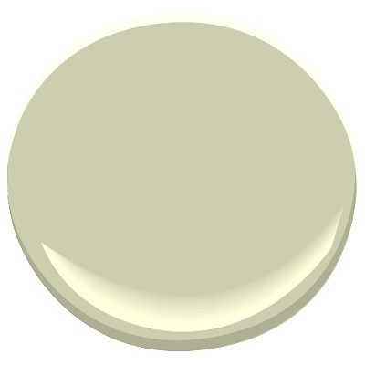
Benjamin Moore HC-116
2. On the other hand, deep, moody, saturated colours are also in, if you so desire.
Design bloggers got all worked up this past December over Pantone’s Colour of the Year. The reaction was overwhelmingly negative. The design world had been doing deep moody blue rooms for a couple of years and many surely thought Pantone would pick up on that.
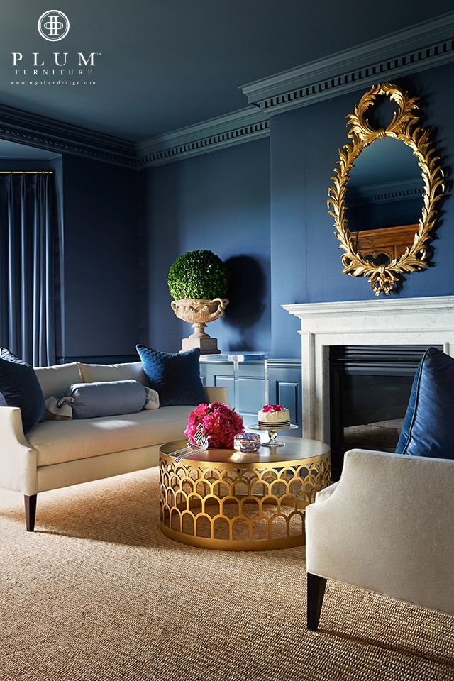
Moody Blues by Plum Furniture
Others in the design world, myself included, thought that it was red’s turn. We also saw a lot of that at the High Point Furniture Market.
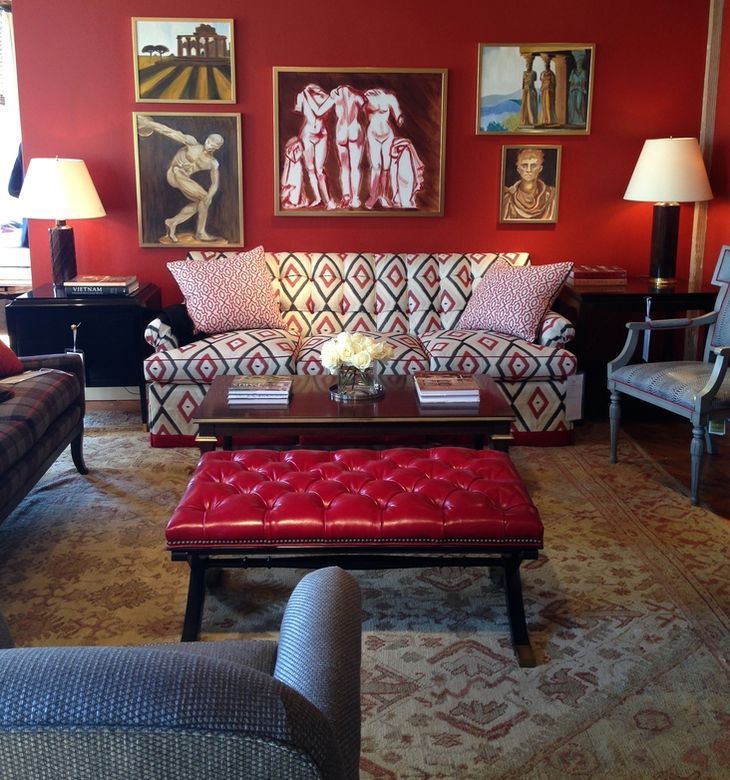
Alexa Hampton Furniture at High Point Market
Well, remember the ‘anti-trend’ trend? I think Pantone was on to something. They opted for a colour that totally went against everyone’s grain. They describe ‘Marsala’, their colour choice, as ‘nurturing, fulfilling and grounded…enriching our minds, bodies and soul’.
“Marsala’ – Pantone Colour of the Year 2015
Interior Design in General
1. Mixed Metals. Golds are it, followed by pink golds and coppers. Gold has been back for a couple of years but what is more prominent now is the mixing of metals. Again, too much of anything looks like you’ve tried too hard. The key is how to mix. Principles of proportion, balance and repetition in design will help you determine this.
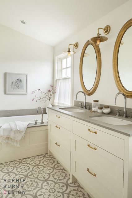
Sophie Burke Design
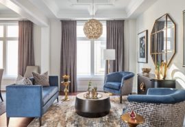
2. Clean lined Traditional with a modern twist. Its not your grandmother’s kind of traditional but it speaks to the past. In line with Pantone’s thinking again. People want a warmer and more nurturing experience. Below is an inviting layered family room. The wing chair and the drapery soften the straight lines everywhere else. The ikat pattern on the back of the chairs liven the room with pattern and colour.
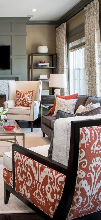
Atmosphere Design
Katie Stassi Design has been on my radar lately. Love the classic period pieces of furniture mixed with the more modern coffee table, lamps and art. Just a few more pillows to soften the furniture and that would put me over the moon.
Katie Stassi Design
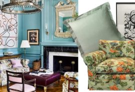
3. The last design trend we want to leave you with is one that I think few Canadians will embrace in a large way. Canadian House and Home has referred to it as South American Fusion, Christiane Lemieux has talked about the Brazilian influence, and other bloggers refer to a trend towards patterned and colourful tile (think spanish patterned or moroccan patterned tile). Its more ‘meaty’ than vintage; has a bohemian flair and is very colourful. Aside from a few grown up hipsters, I think this trend will be used more sparingly. Small accessories or accent chairs perhaps combined with the above modern trad trend might be used by well travelled individuals. It will be a way to showcase their global worldliness.
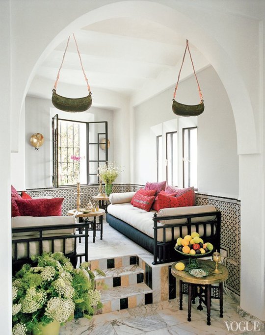
Via Apartment Therapy
In 2015 it will be about bringing home what rings true for you. The true trend in design is to reflect a home that is uniquely you – something authentic to your soul.
If you need help in curating a look for you, please give us a call or [email protected]